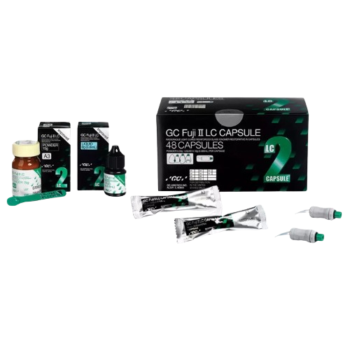
GC Fuji II LC®
GC Fuji II LC® is a light-cured, resin-reinforced glass ionomer restorative material designed for Class III and V restorations, cervical lesions, root surface caries, and as a base/liner.
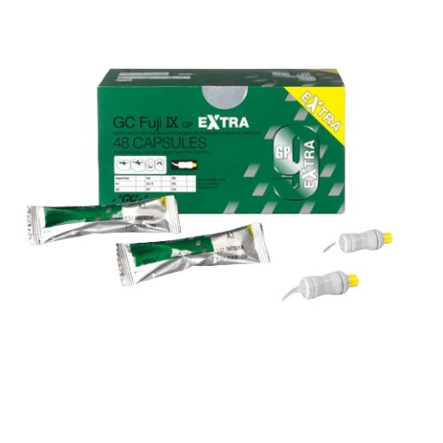
GC Fuji IX GP® EXTRA
GC Fuji IX GP® EXTRA is a self‑cured, packable glass ionomer restorative material with enhanced properties for durable posterior restorations. It offers extra fast setting, higher fluoride release, and improved translucency for better aesthetics and clinical performance. Ideal for Class I & II restorations and transitional uses with strong marginal seal and reliable handling.
399.00 AED
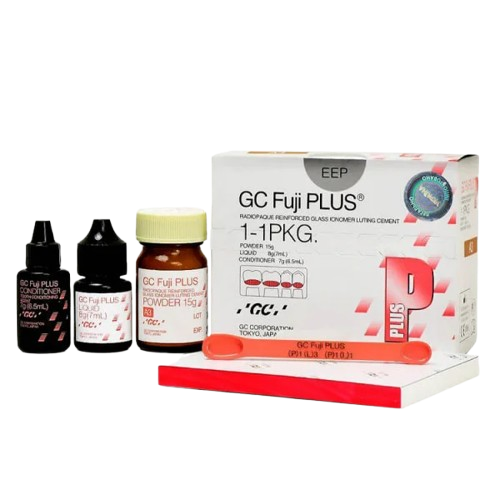
GC Fuji PLUS, Intro Package 1:1:1, A3
GC Fuji PLUS, Intro Package 1:1:1, A3 is a glass ionomer restorative material kit in shade A3 with a 1:1:1 powder:liquid ratio for simple mixing. It delivers chemical adhesion to tooth, sustained fluoride release, and good wear resistance for reliable restorations. Easy to handle and ideal for everyday restorative procedures with esthetic results.
400.00 AED
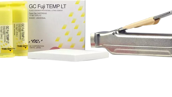
GC Fuji TEMP LT™
GC Fuji TEMP LT™ is a light‑curable, esthetic temporary restorative material that sets quickly with a curing light for same‑visit provisional fillings. It offers good strength, excellent polishability, and smooth surface finish in temporary restorations. Ideal for short‑ to medium‑term restorations with reliable handling and patient comfort.
340.00 AED
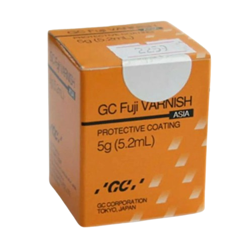
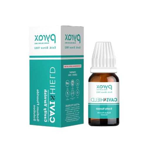
GC Fuji Varnish (5gm)
GC Fuji Varnish (5 g) is a protective dental varnish that seals freshly placed glass ionomer restorations and reduces early moisture sensitivity. It helps enhance marginal seal and prolong restoration longevity while being easy to apply. Ideal for use after cementation or restorative procedures to improve surface protection and patient comfort.
638.00 AED
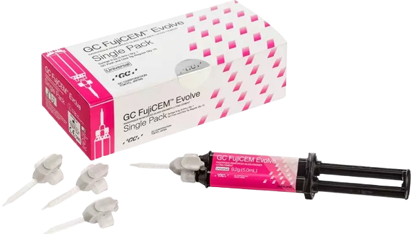
GC FujiCEM® Evolve
Building on the legacy GC FujiCEM® 2, new GC FujiCEM® Evolve takes the luting process to the next level!
200.00 AED
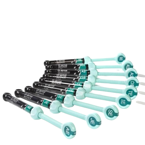
GC G-Aenial Anterior
GC G‑Aenial Anterior is a high‑esthetic, light‑cured composite resin formulated for anterior restorations with natural translucency and polishability. It delivers excellent handling, shade matching, and long‑lasting esthetic results. Ideal for Class III–V and aesthetic smile‑enhancing restorations.
2,755.00 AED
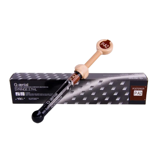
GC G-Aenial Posterior
GC G‑Aenial Posterior is a light‑cured composite resin designed for durable, high‑strength posterior restorations with excellent wear resistance. It offers smooth handling, strong polishability, and reliable occlusal performance. Ideal for Class I and II restorations with esthetic, long‑lasting results.
4,542.00 AED
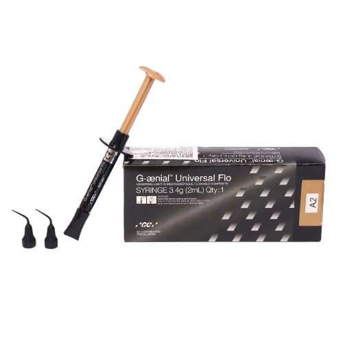
GC G-Aenial Universal Flo Syringe Refills
GC G‑Aenial Universal Flo Syringe Refills are flowable composite resin refills for precise, easy application in restorative procedures. They offer excellent adaptation, smooth handling, and esthetic results across a wide range of indications. Ideal for small restorations, liners, and margin refinement with reliable polishability and strength.
1,214.00 AED
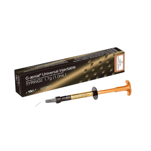
GC G-Aenial Universal Injectable Refills
GC G‑Aenial Universal Injectable Refills are injectable flowable composite resins that provide effortless delivery and adaptation to cavity walls. They offer excellent esthetics, smooth handling, and high polishability. Ideal for minimally invasive restorations, small defects, and margin refinement in everyday restorative dentistry.
2,030.00 AED
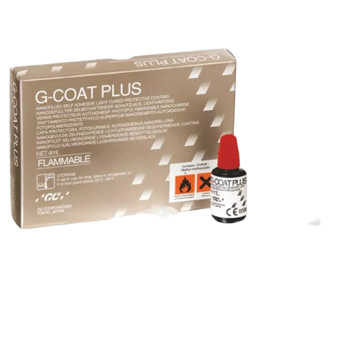
GC G-Coat Plus Protective Coating
GC G‑Coat Plus Protective Coating is a light‑cured, low‑viscosity surface sealant that enhances the wear resistance and polishability of composite and glass hybrid restorations. It provides a durable, glossy, protective layer that helps reduce microleakage and surface staining. Easy to apply and cure, it improves long‑term esthetics and restoration longevity.
3,733.00 AED
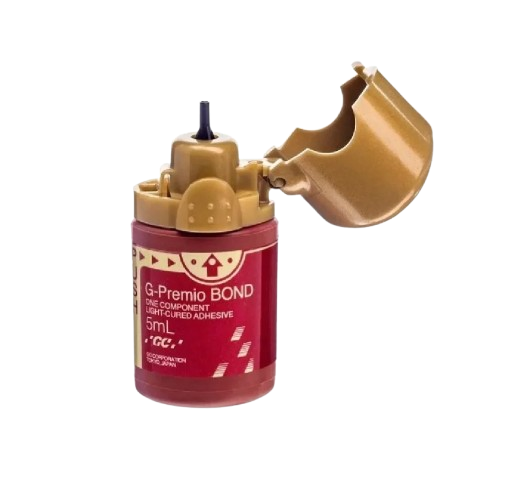
GC G-Premio Bond
GC G‑Premio Bond is a universal dental bonding agent that provides strong adhesion to enamel and dentin with simplified application. It offers excellent bond strength, low technique sensitivity, and versatile compatibility with self‑etch, selective‑etch, and total‑etch modes. Ideal for use in restorative and adhesive procedures with reliable, long‑lasting results.
4,161.00 AED
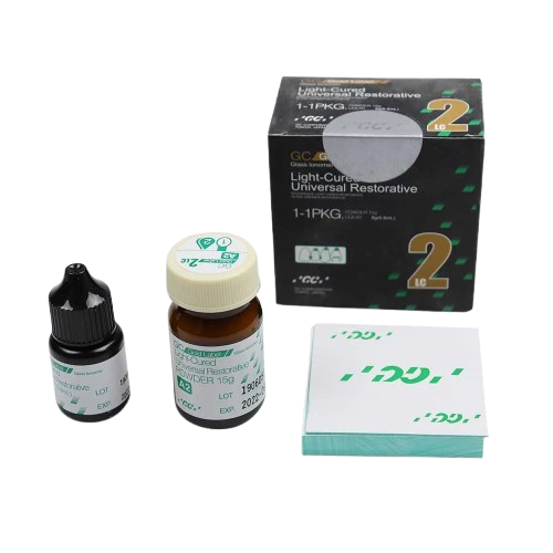
GC Gold Label 2 Lc (Light-Cured)
GC Gold Label 2 LC (Light‑Cured) is a light‑activated glass ionomer restorative material combining the benefits of glass ionomer chemistry with resin reinforcement for enhanced strength. It offers excellent esthetics, fluoride release, and reliable adhesion to tooth structure. Easy to place with immediate light cure, it’s ideal for Class III/V and cervical restorations with improved handling and durable results.
1,350.00 AED
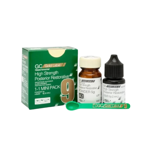
GC Gold Label 9 Posterior Restorative GIC
GC Gold Label 9 Posterior Restorative GIC is a high‑strength glass ionomer restorative material specifically designed for durable posterior restorations. It offers excellent wear resistance, sustained fluoride release, and reliable adhesion to enamel and dentin. Easy to handle with consistent clinical performance for everyday posterior restorative needs.
1,350.00 AED
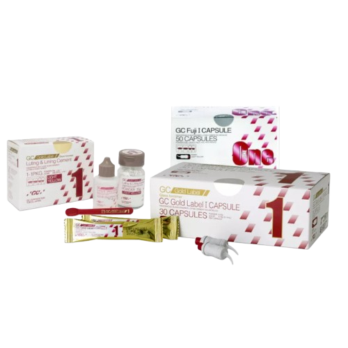
GC Gold Label I / Fuji I
GC Gold Label I / Fuji I is a self-cured glass ionomer luting and lining cement used primarily for final cementation of crowns, bridges, inlays/onlays, posts, and orthodontic brackets.
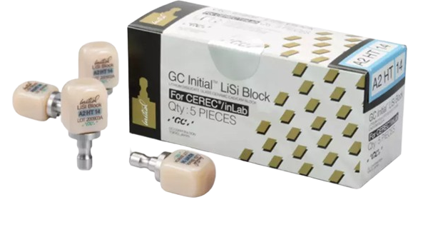
GC Initial® LiSi Block
A fully crystallized lithium disilicate block that delivers optimal physical and aesthetic properties without firing.
2,000.00 AED
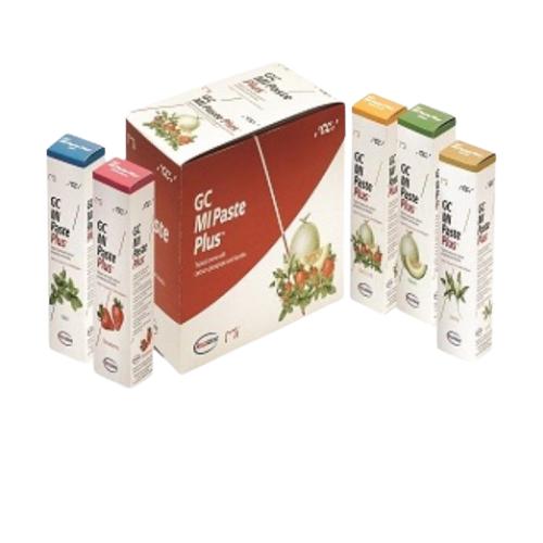
GC MI Paste Plus Assortment (Tropical Tooth Creme With Calcium, Phosphate and Fluoride)
GC MI Paste Plus Assortment (Tropical Tooth Creme with Calcium, Phosphate, and Fluoride) is a remineralizing dental creme that helps restore essential minerals to tooth enamel, reduce sensitivity, and provide added protection against decay. Formulated with CPP‑ACP (casein phosphopeptide–amorphous calcium phosphate) and fluoride, it supports strengthening and remineralization of weakened enamel. Easy to apply and gentle, it’s ideal for daily use to enhance oral health and reduce sensitivity.
975.00 AED
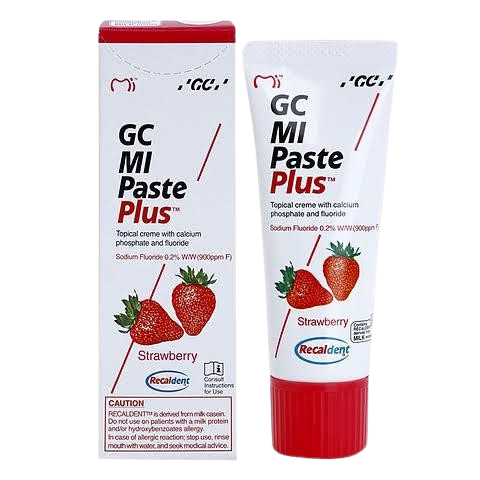
GC MI Paste Plus Strawberry (Tropical Tooth Creme With Calcium, Phosphate and Fluoride)
GC MI Paste Plus Strawberry (Tropical Tooth Creme with Calcium, Phosphate, and Fluoride) is a remineralizing dental crème that helps restore essential minerals to enamel, reduce sensitivity, and enhance cavity protection. Formulated with CPP‑ACP (Recaldent®) plus fluoride, it delivers calcium, phosphate, and fluoride to strengthen and protect teeth. Its strawberry flavor makes it pleasant and easy to use for daily preventive oral care.
120.00 AED
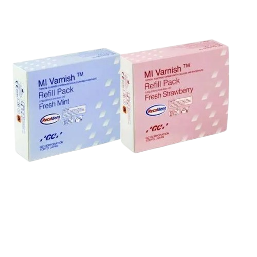
GC Mi Varnish
GC MI Varnish is a fluoride‑releasing dental varnish that delivers high levels of bioavailable calcium, phosphate (CPP‑ACP), and fluoride to help prevent caries, remineralize enamel, and reduce sensitivity. Its easy‑to‑apply formula quickly adheres to tooth surfaces for enhanced protection and long‑lasting benefits. Ideal for use in preventive and therapeutic dental care to strengthen enamel and support overall oral health.
5,142.00 AED
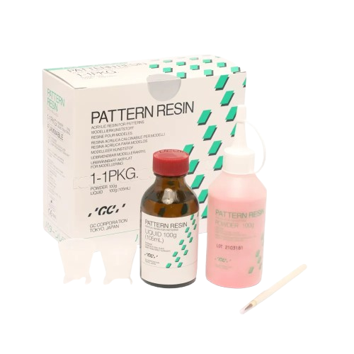
GC Pattern Resin 1-1 Package
GC Pattern Resin 1‑1 Package is a self‑curing acrylic resin system used for creating dental patterns for crowns, bridges, inlays/onlays, and implant prosthetics. It offers fast, dimensionally stable polymerization with low shrinkage and smooth handling for precise pattern fabrication. Ideal for accurate laboratory work and reliable results in restorative workflows.
4,575.00 AED